Clustering Neighborhood Change in Austin
Using census data and unsupervised learning to investigate socioeconomic change, price inequality, and gentrification
Part 1 - Project Proposal
Part 2 - Data Wrangling
Part 3 - Exploratory Data Analysis
Part 4 - Choosing a Clustering Algorithm
Part 5 - Clustering Analysis
Part 6 - Closing Remarks
Part 1 - Project Proposal
Problem:
Austin is my home, I love it here, and I plan on being here for as long as possible. The city is diverse, open-minded, exciting, entertaining, and beautiful. There are countless music venues, locally owned shops and restaurants, parks, protected green spaces, and secret swimming holes. But Austin is changing, and FAST! For the past decade, Austin has consistently been at or near the top of the fastest growing large cities in the United States. While this population influx is a boon for the city in general, many residents have been or will be unwillingly displaced from their long-time homes due to increased cost of living associated with higher home prices and subsequent hike in real estate taxes.
The dynamic nature of population change in Austin is causing a pronounced shift in the neighborhood socioeconomic structure. While this shift is a natural process by which cities evolve, the accelerated nature of this shift in certain neighborhoods threatens the livelihood of many long-tenured residents. By understanding key characteristics of neighborhoods which are undergoing the most rapid change, it may be possible to minimize or slow displacement of an underprivileged, underrepresented population while still allowing for meaningful economic growth of the city as a whole.
My Client:
My target client for this project would be the City of Austin. Understanding the factors which force rapid neighborhood change, the city can implement certain regulations that could minimize displacement, unaffordability, and inequality in these neighborhoods. Here is the City of Austin’s “Vision for the Future” written in 2012:
As it approaches its 200th anniversary, Austin is a beacon of sustainability, social equity, and economic opportunity; where diversity and creativity are celebrated; where community needs and values are recognized; where leadership comes from its citizens, and where the necessities of life are affordable and accessible to all complete communities.
It’s clear from this statement that Austin has the desire to protect its diverse population as well as facilitate a prosperous economy. This project will give a deeper understanding of neighborhood demographic change to aid the City of Austin in realizing it’s vision.
Data
For this project I’ll be using data from the United States Census Bureau and the American Community Survey (ACS). The Census Bureau conducts the decennial (every 10 years) census of the entire population while the ACS conducts yearly surveys at a 1:480 scale which are then aggregated into a 5-year estimate. I’ll be using data from the 2000 census and the 2009-2016 ACS 5-year estimates which are available through the Census Bureau’s American FactFinder portal. All data will be presented in the census tract geography, which is meant to approximately represent a neighborhood.
The data variables that I will be using are meant to be representative of a neighborhood’s social and economic demographics as well as housing market characteristics. Here’s a brief description of the variables I’ll be targeting for this study:
- Income (binned interval)
- Education attained (binned ordinal)
- Racial makeup (percentage of population)
- Rent (binned interval)
- Home Value (binned interval)
- Employment (percentage of workforce)
Approach
Because the data for this study does not include labels, I’ll be taking an “Unsupervised Learning” approach using clustering and dimension reduction. I’ll start by pooling all the data for every year and applying k-means clustering and silhouette analysis to estimate the optimum number of clusters and measure the quality of cluster composition. Next I will try a year-by-year clustering. This will be more difficult since each cluster for each year will need to be analyzed to see how it relates to clusters from the previous and following years.
My hypothesis is that some neighborhoods will move rapidly between clusters, indicating a region prone to residential displacement and price inequality. Once these neighborhoods have been identified, I’ll search for visual evidence (photos) of the change through the years to bolster my arguments.
Deliverables:
The deliverables for this project will be code (Jupyter Notebooks), a write-up of the project analysis and conclusions (Github blog, Jupyter Notebook, PDF), a set of slides for presenting results (Jupyter Notebook or PowerPoint), and a video presentation of the study (YouTube).
Part 2 - Data Wrangling
The code for this section is located in three notebooks in the project’s repository:
Data Preprocessing
Data Cleansing
Census Tract Relationships
Data Sources:
The United States Census Bureau (USCB) provides easy access to all census related datasets through their American FactFinder portal. They offer community summaries, guided data retrieval, and advanced searching capabilities. For my purposes, the advanced search was used to identify and acquire the necessary datasets at the census tract level. For this study I acquired datasets which contained household income, home value, rental price, education attained, racial makeup, and employment rate for the years 2000, and 2009-2016. The geography will be limited to the metropolitan statistical area (MSA) for Austin which includes Bastrop, Caldwell, Hays, Travis, and Williamson Counties.
Census tracts are designed to be roughly equivalent to neighborhoods in that they generally have a population between 2,500 and 8,000 people. Geographic reference maps (shapefiles) of the 2000 and 2010 census tracts were obtained from the USCB’s Maps & Data site. While census tracts are considered semi-permanent, they do change over time. To relate previous census tracts configurations to the most current census tracts, relationship files must be utilized.
Finally, to accurately compare income and cost of living values over time, the monetary features were adjusted to 2016 prices. For this, I used the Bureau of Labor Statistics’ (BLS) Consumer Price Index Research Series (CPI_U_RS).
Data Munging:
Dropping and Renaming Columns
The raw census data from USCB contained many fields that weren’t needed for the clustering analysis, so they were dropped at the reading stage. These fields typically contained data that were grouped at different demographic levels other than for the entire population (e.g. income by sex, education by race, unemployment by age, etc.) as well as margins of error on estimates. Additionally, the column headings were in a descriptive form and were changed to a more succinct, compact version. For example, in the household income table, the field Estimate; Total: - $10,000 to $14,999 was changed to [10k-15k) where the interval is inclusive on the low end and exclusive on the high end.
Relating Census Tracts
Directly after reading the data, the relationship files were used to convert census tracts from the 2000 decennial census (years 2000 and 2009) to the 2010 decennial census (years 2010-2016). This was done using a population percentage change from census tracts that either merged multiple tracts into single tract or split a single tract into multiple tracts between 2000 and 2010. I only considered census tract changes which had a >5% change in population.
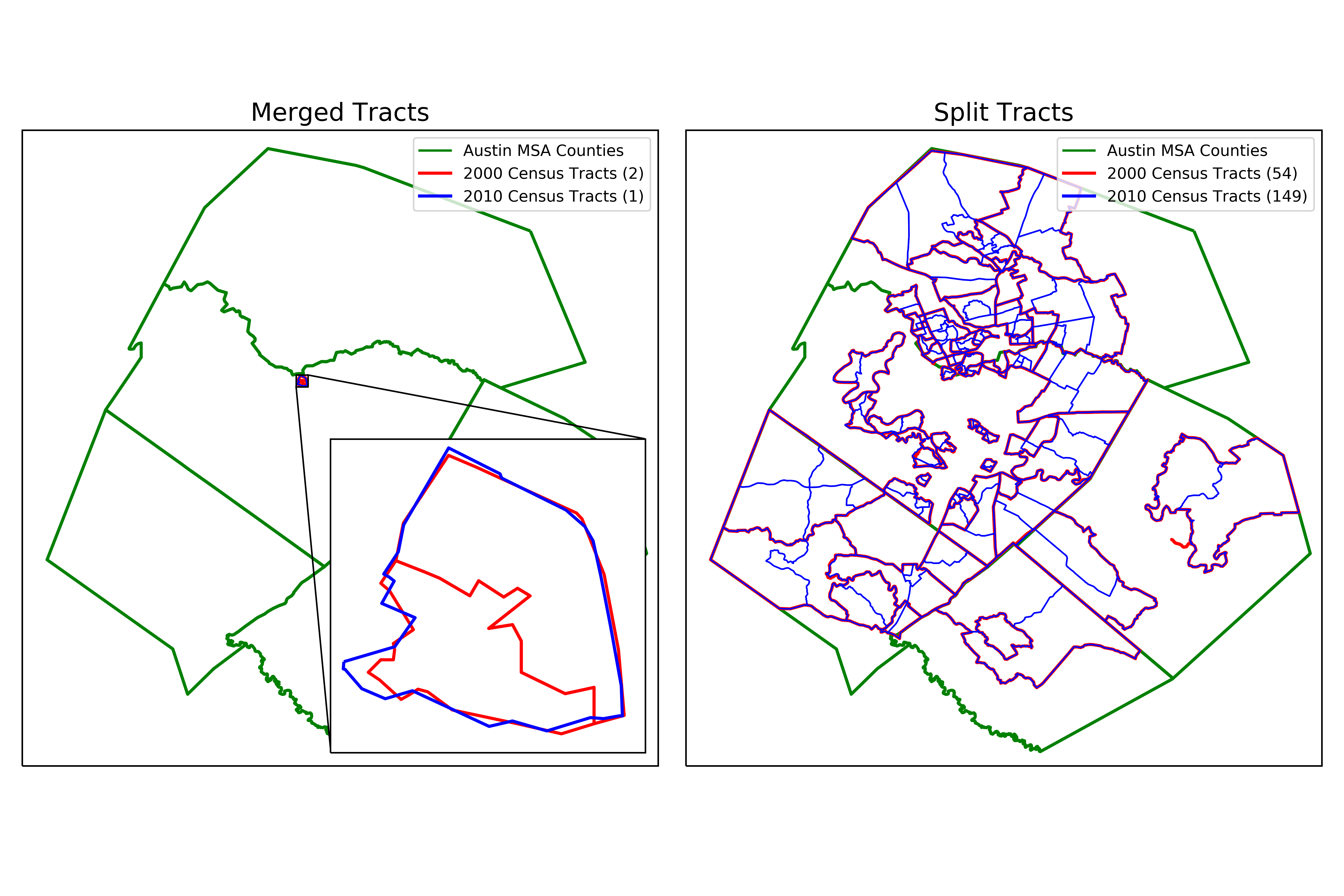
The figure above shows only the census tracts that changed more than 5% in total population between the decennial censuses. The 2000 census contained 256 tracts while the 2010 census contained 350.
Binned Features
The binned features did not share the same columns throughout the years; some years had more bins and some had less. Bins that were common to every year were ultimately used, and years which had more bins were aggregated to match.
Interval
The household income, home value, and rental price datasets contained monetary values that were partitioned into somewhat even bins. These binned interval features contained totals and a count of the number of occurrences for each bin (much like a histogram). The bin counts were divided by the total for that tract to get a percentage in each bin. This allowed for better comparison of tracts with varying populations.
Ordinal
The education attained table was ordinally binned by highest level of education completed, ranging from less than high school to graduate (which included masters, doctorate, and professional degrees). As with the binned interval features, education attained was converted to percentages in each bin for each tract for better comparison.
Creating Indexes
To reduce the binned data down to a single number for clustering, an index was created for each binned variable. For the interval variables, the percentage in each bin was multiplied by the middle point for that bin’s interval range. This required making a conservative assumption of the middle point for the uppermost bin (e.g. for income >200k). These can roughly be thought about as the median value for a distribution which is represented by the bins. The index for education attained was created similarly, except that a simple range of 1 to 8 was used as a multiplying factor because of the ordinal nature of the bins.
Percentages
The employed feature is the percentage of the eligible workforce that was employed at the time of the census. The racial demographic feature was simplified down to a single percentage which represents the percentage of the population that is white for each tract. This can be thought of as an indicator for diversity.
Adjusting for Inflation
The CPI_U_RS data was used to calculate inflation factors for each of the years in relation to 2016. The monetary indexes were then multiplied by this inflation factor so they could be more reliably compared.
Data Cleansing:
To ensure a fair and robust clustering analysis, the data was checked for missing values (in this case zeros). A total of 10 tracts were found to have missing data. Upon investigating the census tracts with missing values using various mapping tools, 3 were found to have missing values that could be imputed while the remaining 7 tracts could not and were excluded.
Imputing Rent Index
There are three census tracts which had zero values for rent index (6 data points total). This was caused by the simple fact that there were no properties for rent at the time of the census. These rent index values were imputed by linear interpolation between the previous year that had a non-zero rent index and the next year that had a non-zero rent index.
Dropping Special Tracts
The remaining tracts were special cases that did not fit into the framework for this problem. These were tracts that had no residential households and artificial population demographics. The following list summarizes each census tract that was dropped from the dataset.
| Census Tract | Description |
|---|---|
| 48453000203 | Austin State Hospital |
| Austin School for the Blind | |
| Central Texas Rehabilitation Center | |
| Texas Department of State Health Services | |
| 48453000601 | University of Texas |
| Texas Capitol Complex | |
| 48453001606 | Austin State Supported Living Center |
| 48453001753 | Gateway Shopping Center |
| 48453001849 | J.J. Pickle Research Laboratory |
| The Domain Shopping Center | |
| Industrial Complex | |
| 48453002319 | Travis County Correctional Complex |
| 48453980000 | Austin Bergstrom Airport |
Data Wrangling Summary:
The data wrangling process that I used consisted of several steps. First the data source was identified and the raw data was acquired. Next, unused columns were dropped and used columns were renamed in an intuitive way. Tracts from the 2000 census were converted to 2010 census tracts using relationship files. Binned features were then simplified into indexes so they could be represented with a single number for each tract. Single population demographics were converted to percentages and all monetary features were adjusted for inflation to 2016 prices. Rent index was imputed for three tracts while seven tracts that did not fit the framework of this study were dropped.
After the data wrangling process was complete, I was left with a clean dataset which consisted of 6 features and 3,087 observations (343 neighborhoods * 9 years). This would be my dataset moving forward through the exploratory data analysis and clustering phases.
Part 3 - Exploratory Data Analysis
The code for this EDA is located in the project repository in the notebook Exploratory Data Analysis.
Data Preparation Summary
I’ll start by doing a quick summary of the steps taken for data preparation thus far.
- Raw data gathered and cleaned of unnecessary columns
- 2000 census tracts were converted to 2010 census tracts using population relationships
- Binned variables condensed into a single index value
- Monetary variables adjusted for inflation relative to 2016
- Population variables converted to percentages
- Rent index imputed for missing values
- Special neighborhoods that don’t fit study were removed
So now my cleaned and prepped dataset contains 343 neighborhoods (a.k.a. census tracts or geoids) spanning 9 years (2000 and 2009-2016) for a total of 3,087 observations with 6 features per neighborhood.
High-Level Feature Comparisons
For this section, all observations will be investigated together, independent of the year they were collected. This can be done since the data has been adjusted for inflation, indexed, and converted to per capita proportions. Later we will see how each feature and neighborhood changes over time.
Correlation Matrix
I’ll start by seeing how correlated each of the features is to each other.
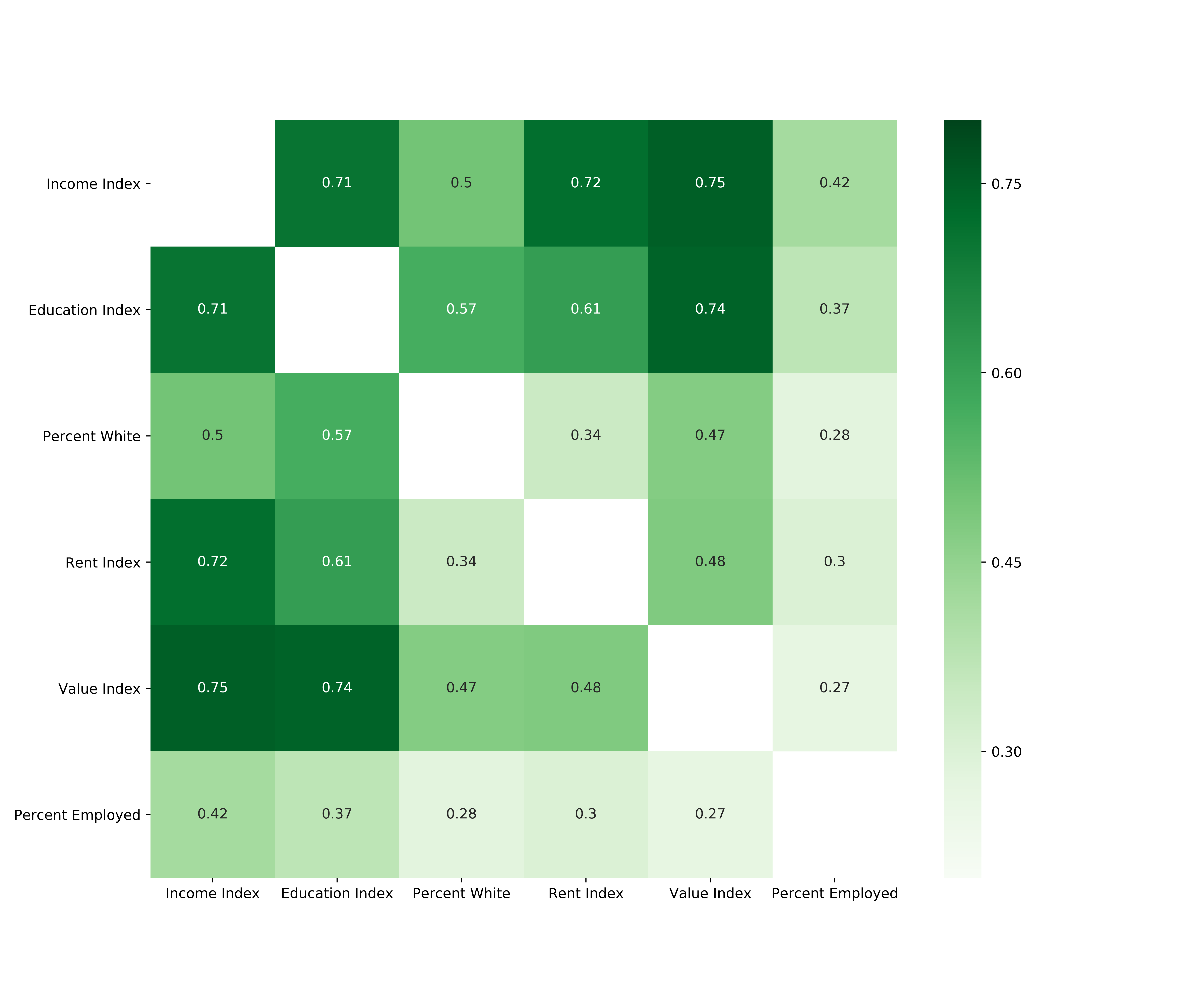
From the above correlation matrix, we can see that all features have positive correlations between 0.27 and 0.75. Education attained shows high correlation with income and home value (0.71 and 0.74 respectively) which is not surprising since higher education typically leads to higher household income which in turn leads to the ability to purchase more expensive housing. Rent and income show similar correlation.
I am surprised to see that the correlation between rent and home value is not higher than 0.48. My intuition would be that neighborhoods with higher home values would also be neighborhoods where rent is high. Perhaps this is reflective of the large number of neighborhoods which intermingle residential housing and apartment complexes.
Another interesting point that opposes my initial expectations is that there is very low correlation between the employment percentage of a neighborhood and the home value even though the correlation between employment rate and income is moderate. Thinking a bit deeper, I can reason how neighborhoods with the highest employment rate would probably not coincide with either the lowest or highest home values. On one hand, I don’t expect neighborhoods with the lowest home values to have full employment because of higher likelihood of a lack of education and substance abuse. Similarly, neighborhoods with the highest home values probably have a large portion of the population that are independently wealthy or comfortably retired, which don’t need to work.
I’ll take a closer look at each one of these relationships a bit later.
Scatter Matrix
While correlation gives a good initial idea of how the features relate to each other, a scatter matrix will give finer relationship details between features. Additionally, the distribution of each feature can be easily visualized with a single line of code.
_ = pd.plotting.scatter_matrix(data[cols], figsize=(12, 12), alpha=0.1,
diagonal='kde', marker='.')
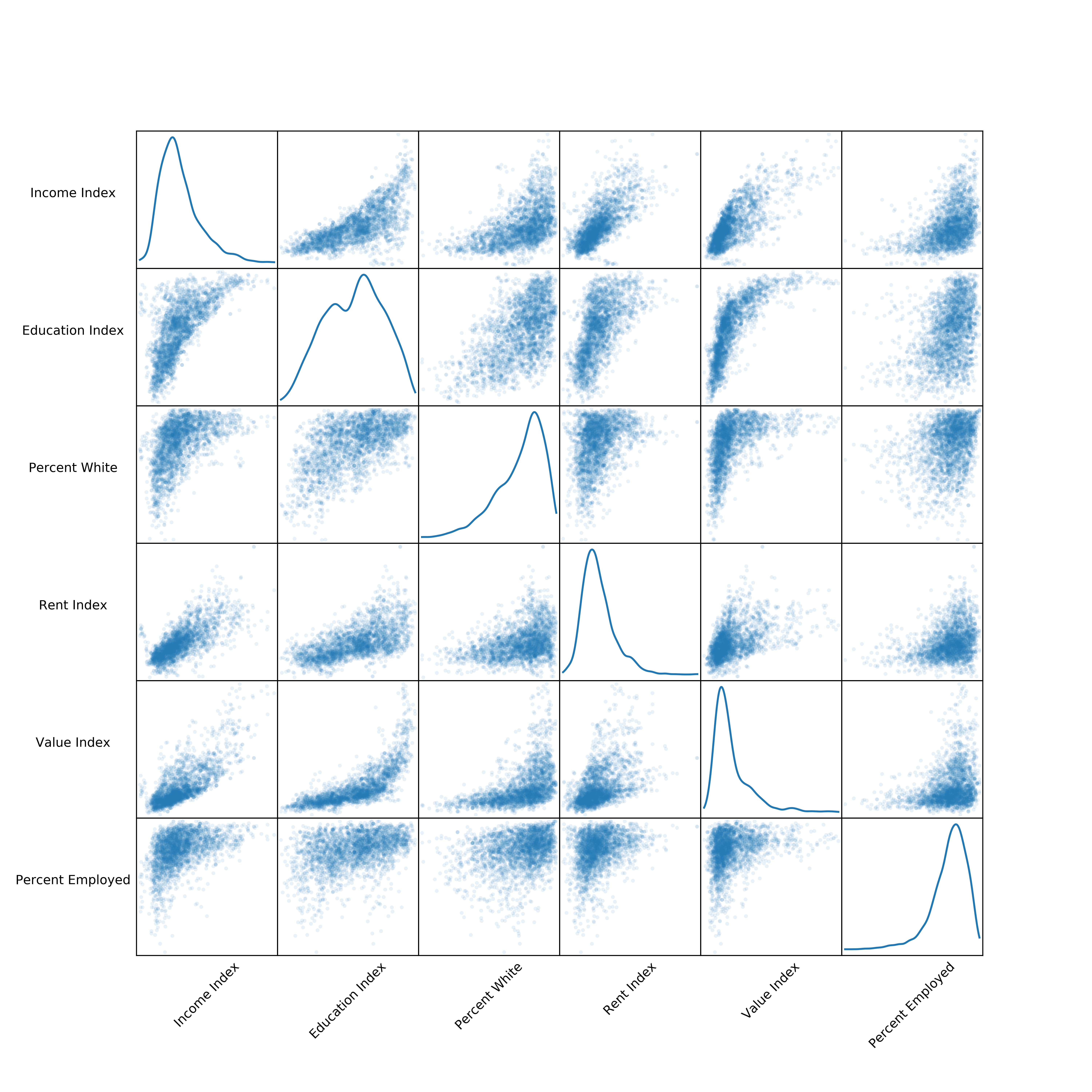
Now we can start to see some of the intricate relationships between the features. Subplots with a large spread in scatter points have a weaker relationship than subplots with tight grouping of points. By using a very low alpha (transparency) value for each point, the darkest color appears where many points overlap. This dark section of each subplot is where the relationship between the features is the most common. For example, the scatter plot of rent versus home value has a very dark region in the lower left corner in which most of the points fall. Beyond that, the relationship gets weaker and point are more spread out, thus the color is lighter. Subplots with a less pronounced dark region represent features with a weak relationship which tend to have a greater spread in scatter points (as seen in the education vs percentage white subplot).
Select Feature Comparisons
In this section I’ll pick a few of the most interesting feature relationships to explain in greater depth. For the comparisons I’ll be using a combination of scatterplots, histograms, and kernel density estimation contours. Seaborn offers an information rich combination plot which is perfect for this sort of comparison (jointplot).
Income vs Home Value
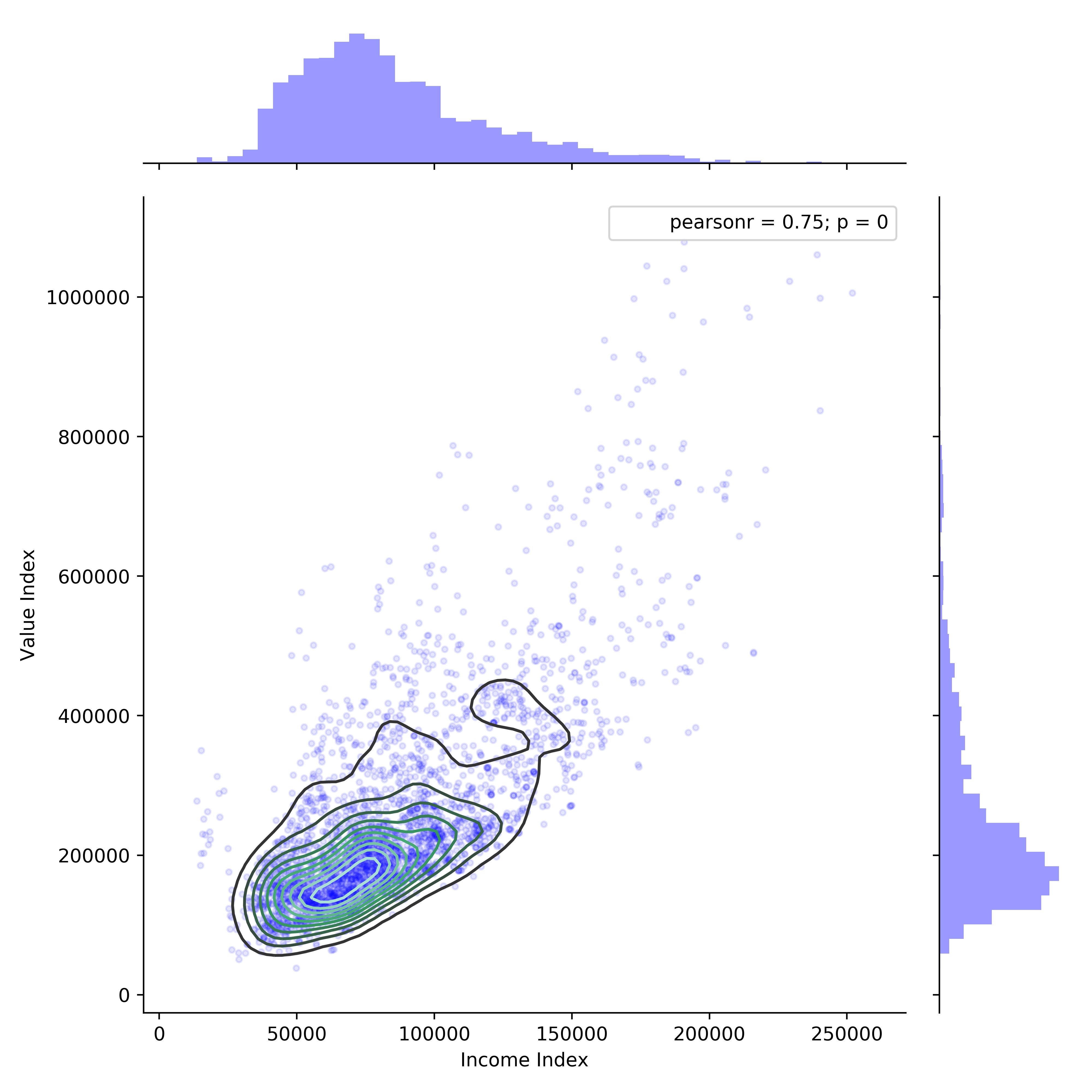
There is clearly a linear relationship between income and home value, which is not surprising. The lower bound of this linear relationship is very pronounced while the upper bound is more variable. Some outliers in this plot show relationships between income and home value that don’t make much sense. For instance, in the lower left-hand corner there are a group of observations that fall outside the density contours that have the lowest income (<\$20k) but comparatively high home values (\$200k - \$300k).
How could this be? It turns out that all of these points belong to two neighborhoods (48453000603 and 48453000604) which are located directly West of the University of Texas campus and have a large student population. The student population drives the income index down while the disirable geographic location drives home values up.
Education vs Income
To understand this relationship I need to explain how the education index was calculated. Education attained was originally a binned ordinal variable which was converted into an index using a simple scoring method. The scores for each level of attained education are described below:
1 - Less than 9th grade
2 - Some high school
3 - Graduated high school
4 - Some college
5 - Associate’s degree
6 - Bachelor’s degree
7 - Graduate degree (includes doctorate and professional degrees)
So an education index of 6 means that the average education attained for a neighborhood would be a bachelor’s degree. Now, we can move forward with the comparison.

While there is clearly a positive psuedo-linear relationship between education attained and income, there seems to be a breakpoint around an education index of 5 (which corresponds to associate’s degree attainment). To the right of this breakpoint, income is much more variable although the potential maximum income is much higher in comparison to lower education attainment. As in the previous comparison of income to home value, the cluster of points at the bottom right of the plot (high education, low income) correspond to neighborhoods with large percentages of students.
Home Value vs Percentage White
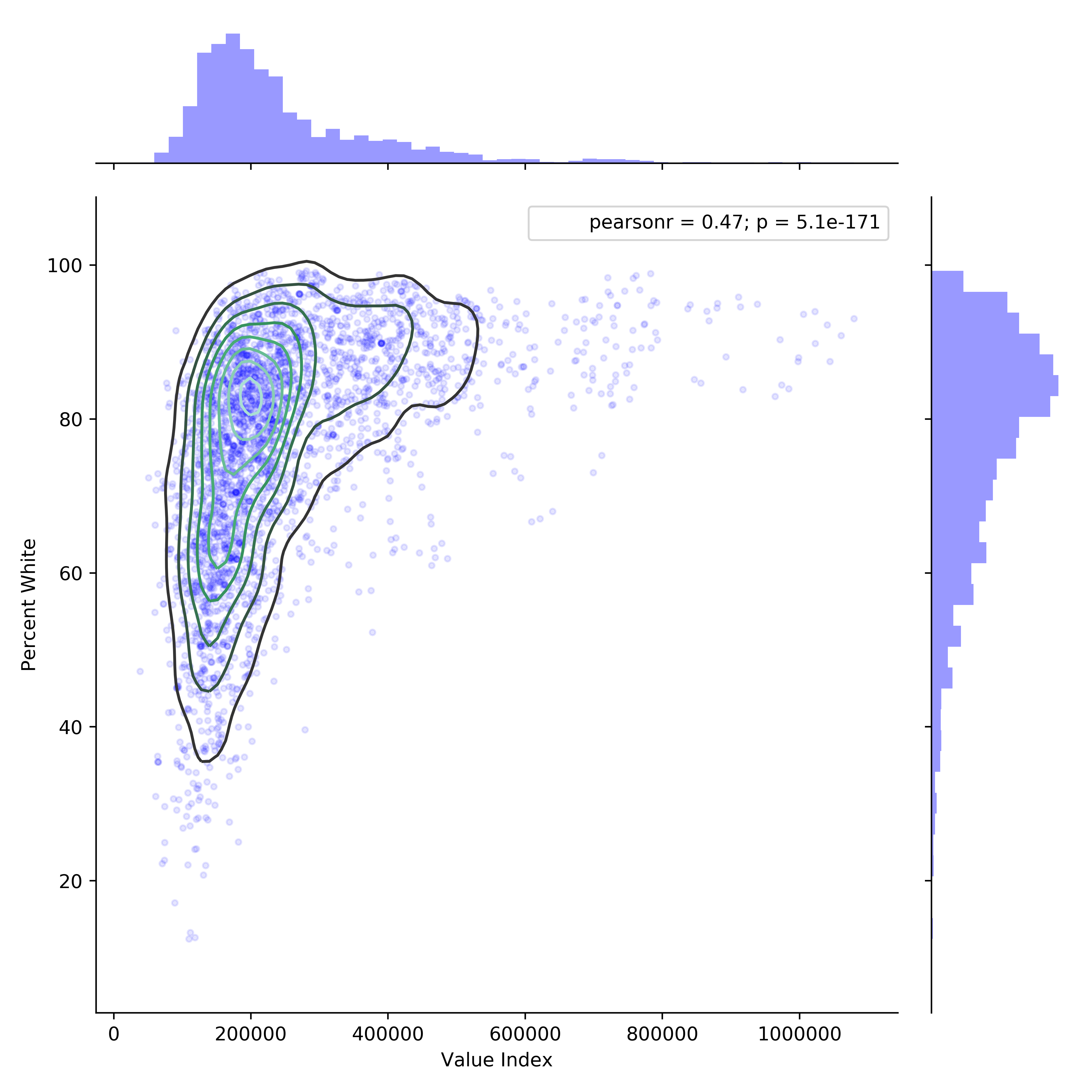
This plot alone tells a very profound socioeconomic story about Austin. While the city boasts about racial equality and affordability, they fail to tell you as these things are apparently mutually exclusive. For instance, the top 100 neighborhoods in terms of home value are nearly 90% white! I’ve personally driven through many of these neighborhoods and can attest to their monochromatic demographics.
Neighborhood Change Over Time
To capture the change in each neighborhood over time, I’ll calculate the difference in each feature between the last (2016) and first (2000) years in the dataset. I’ll also get some descriptive statistics for the neighborhood change.
changes_2000_2016 = data[data['year'] == '2016'][cols] \
- data[data['year'] == '2000'][cols]
changes_2000_2016.describe()
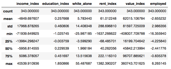
There are a couple of troubling trends here that highlight the growing price inequality in Austin. First, household income is declining while home values are increasing. On average, household income per neighborhood has decreased by almost \$5,000 while home values have increased by about \$62,000.
Second, most neighborhoods are becoming less diverse with the percentage white population changing on average +5.8% with a maximum change of +55.5%! Think about that for a second… over half of a neighborhoods minority population being replaced by only white residents in a span of 16 years. Luckily for the displaced populations, rent has remained relatively stable and affordable, although most would probably prefer to own as opposed to rent.
Neighborhood Change Map
To get a grasp of the spatial extent of neighborhood change in Austin, I’ve created an interactive data viewer with Bokeh (which I’ll describe in a different post) that captures some different aspects of the issues described throughout this post. There is a separate tab for each feature. Green denotes positive change while red denotes negative change. Color intensity represents the magnitude of change. The actual value of change can be seen by hovering the mouse over each neighborhood.
I won’t get into the neighborhood-by-neighborhood details here, as there is just too much information to parse. I will note a few things that stood out to me when using this data viewer.
- The neighborhoods that saw that largest decrease in household income are also the neighborhoods with the highest drop in home values.
- Education attained increased the most just east of Downtown Austin, which has been a hotbed for gentrification in the past decade.
- Minority populations are being displaced out of downtown to the surrounding area (mostly North and West).
- The neighborhoods East of Downtown Austin have changed the most between 2000 and 2016 in terms of income, home value, and racial demographics.
Part 4 - Choosing a Clustering Algorithm
The code for this section is located in the project repository in the notebook Choosing Clustering Algorithm
Considerations
For this project I compared 4 clustering algorithms against my cleaned dataset. In addition to the 4 algorithms discussed below, I also tested the mean shift and DBSCAN algorithms but chose not to include them as they typically find high density clusters while treating low density areas as noise (ie they don’t get assigned to a cluster). Each one of my observations is a neighborhood, so I want them all to be allocated.
My goal for this study was to track a neighborhood’s socioeconomic change over time, which were captured by how a neighborhood changes clusters over time. Because of this, I needed to have a sufficient number of clusters to insure that the movement is clear. If I chose just a small number of clusters, only large changes in a neighborhood’s socioeconomics would be captured. Too many clusters would add too much complexity which would work against the goals of this analysis. Using these considerations, I chose to consider 5 to 10 clusters for each algorithm and score them by silhouette score (discussed later in this section).
K-Means
K-means is typically the go-to off-the-shelf model for clustering applications. It’s fast, easy to understand, and available in pretty much every statistical learning tool. The basic steps for k-means clustering are:
- Choose number of clusters (k)
- Initialize the k cluster centroids randomly
- sklearn initializes the centroids using the k-means++ careful seeding technique (more information here) which reduces complexity and speeds up convergence
- Assign each data point to the closest centroid
- using Euclidean distance
- Calculate the cluster centroid based on the mean of all observations assigned to each centroid
- Repeat steps 3 and 4 until the centroids don’t change
- or until the change is less than some stopping threshold
A drawback of k-means is that the user must choose the number of clusters before running the model even if the ideal number of clusters is not known. One method to validate the number of clusters is referred to as the “elbow method”. Essentially, the user can run k-means on the dataset with a range of values for k, calculate the within clusters sum of squared errors (wcss) for each cluster, and plot the number of clusters vs the wcss. In all cases the wcss will decrease as the number of clusters increases, due to increased flexibility in the model. In cases where the clusters are well separated, there will be a kink in the plot that resembles an elbow. At this point, the error stops decreasing rapidly, which indicates the optimal number of clusters for that dataset. In practice however, this “elbow” is usually hard to identify for clusters that are more ambiguous.
Hierarchical Agglomerative Clustering
The fundamental process for agglomerative clustering is:
- Each observation starts in its own cluster
- Compute the between cluster distance based on the linkage criterion
- ward linkage minimizes the variance of the clusters being merged
- average linkage uses the average distances of each observations in the two clusters
- complete linkage uses the maximum distance between observations of the two clusters
- Merge the two clusters that have the smallest calculated distance
- Repeat steps 2 and 3 until only a single cluster remains
The results from agglomerative clustering can then be visualized in the form of a dendrogram, which looks like a hierarchical tree with the distances between merged clusters on the y-axis.
Similar to k-means clustering, the number of clusters must be specified. In cases where the clusters are well separated, there will be a distinct cutoff point in the dendrogram (a horizontal line) which dissects the maximum distance between merged clusters, where the number of clusters is the number of vertical lines the horizontal line crosses. Also similar to k-means, this cutoff point is often ambiguous and hard to identify.
Affinity Propagation
Affinity propagation is a newer clustering algorithm that avoids the problem of having to choose the number of clusters by identifying exemplars among observations. The algorithm simultaneously considers all observations as potential exemplars and exchanges “messages” between observations until a good set of exemplars and clusters emerge. Essentially the algorithm lets the observations “vote” on their preferred exemplar. Once the optimal exemplars are found, a process similar to k-means is utilized to form clusters by assigning each observation to its closest exemplar.
Tuning the affinity propagation model is done using the preference and damping factor hyperparameters, although this process is not very intuitive. Preference controls how many exemplars are used while the damping factor is tuned to avoid numerical oscillations when updating messages.
Spectral Clustering
Spectral clustering makes use of the eigenvalues of the similarity matrix of the observations to project the data into a lower-dimensional space where they are easily separable. After the dimensionality reduction, the lower-dimensional data can be clustered using an algorithm such as k-means.
The number of clusters must be specified when using spectral cluster, just as in k-means. The most stable number of clusters is usually given by the largest difference between consecutive eigenvalues (minimizes the eigengap).
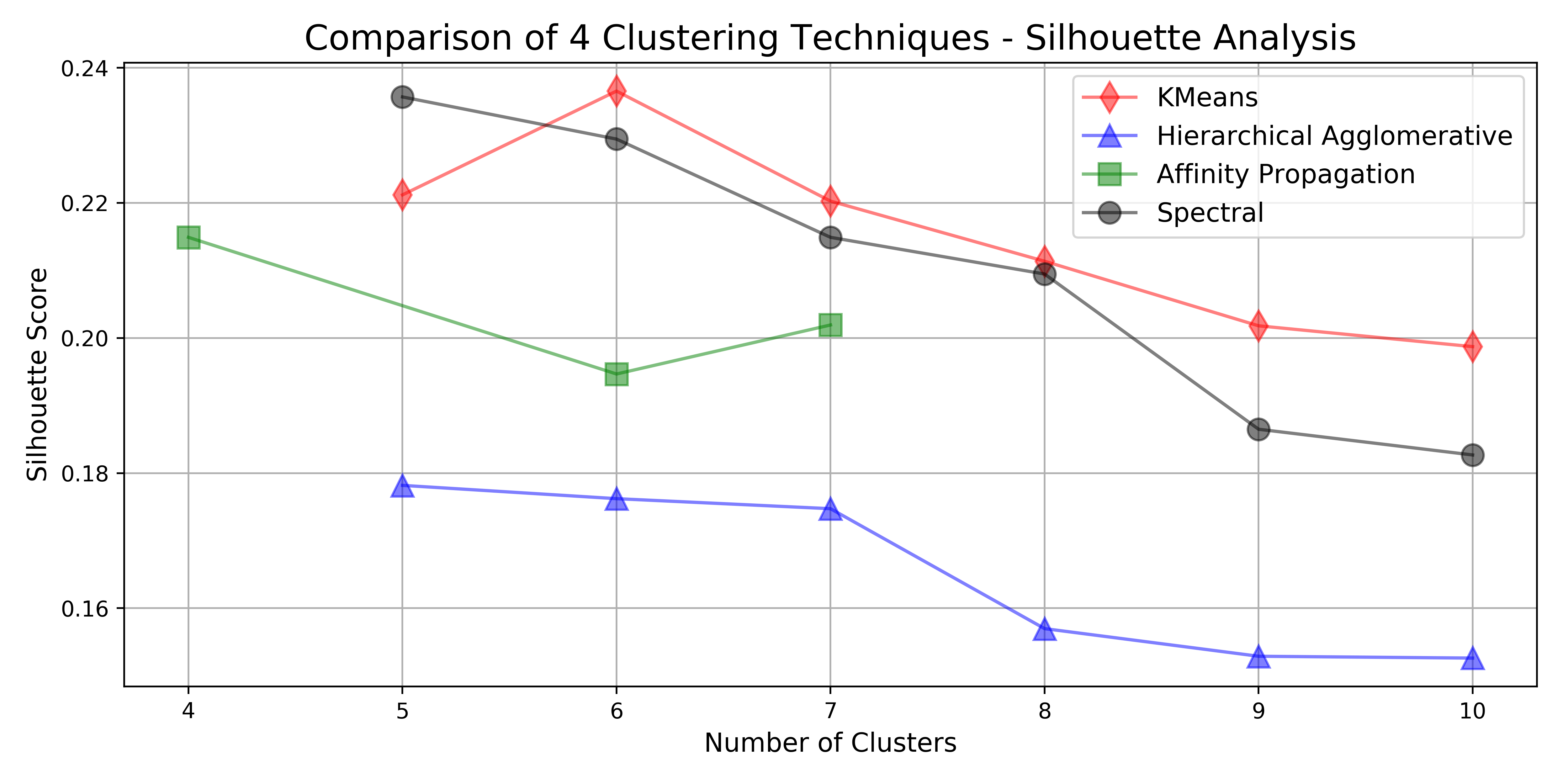
Scoring the Algorithms
Silhouette analysis is a way to measure how similar an observation is to its own cluster as compared to other clusters. The in-cluster similarity is known as cohesion, while the out-of-cluster similarity is known as separation. High values of the silhouette score (close to +1) indicates that the observations in a cluster are much more similar to other observations in that cluster than they are to observations in other clusters.
Comparison
For this comparison I chose to display only the two results with the highest silhouette score. For the full analysis of all algorithms on the full range of number of clusters, see the source notebook in the project’s repository.
Below is the silhouette scores for all algorithms that were tested on this dataset.
To visually compare the clustering, I used dimensionality reduction to reduce the data to two-dimensions using both principal component analysis (PCA) and t-distributed stochastic neighbor embedding (tSNE). For an interesting visual comparison of how these two dimensionality reduction techniques capture the variability in this dataset, see this notebook.
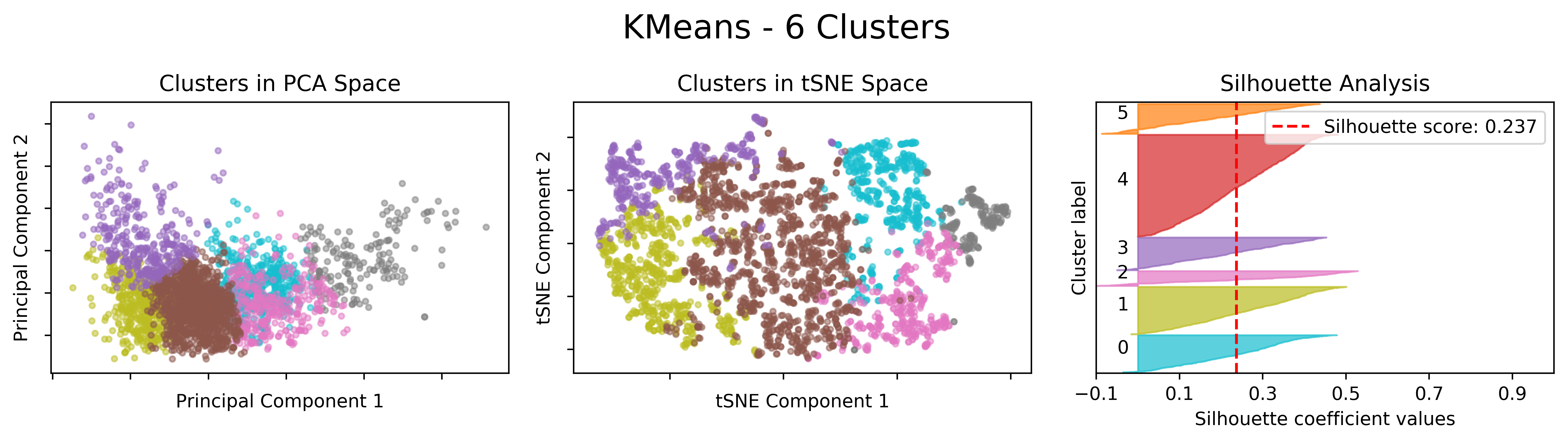
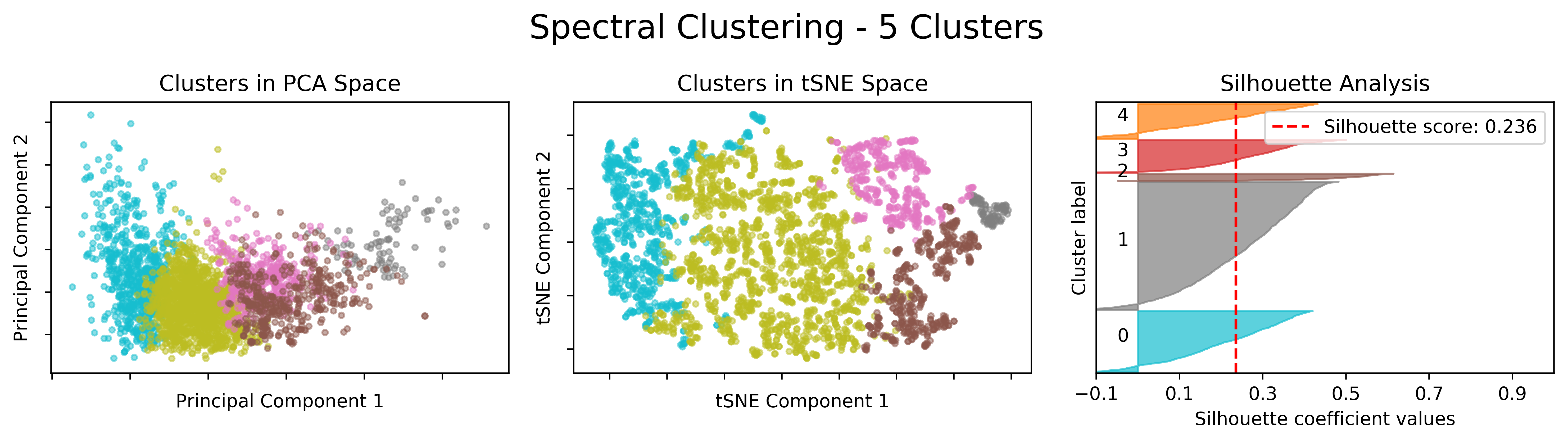
From the plots above, the k-means clustering seems to produce reasonably more balanced cluster sizes than spectral clustering with less negative silhouette values. Also, k-means has a slightly higher silhouette score and is much easier to understand conceptually than spectral clustering. For these reasons, I chose to use k-means clustering with 6 clusters for the socioeconomic change analysis that follows.
Part 5 - Clustering Analysis
The code for this section is located in the project repository in the notebook Clustering Analysis.
In order to see how the neighborhoods move between clusters over the years, it’s important that the clustering algorithm be consistent for the entire dataset. At first, I though about training the k-means algorithm on the first year and use that model to predict clusters for subsequent years. The problem with this technique was that not all the observations would be considered in the training phase of the model, meaning that the only real analysis that could be done was a comparison to year 2000. In the end, I decided to train the model on all the observations simultaneously, that way the model would consider each observation fairly. This is possible because I adjusted all the observations by inflation estimates to 2016 values.
Ordering of Clusters
After performing the k-means clustering with 6 clusters, I needed a way to logically order the clusters that made sense for this analysis. In my mind, home value was the most important feature for identifying neighborhoods that were experiencing drastic socioeconomic changes, although similar arguments could be made to justify using any of the features. Neighborhoods in which home values increased substantially in the time frame of this dataset were potentially suffering from price inequality and gentrification. With this in mind, I ordered the clusters based on the median home value index, with 1 being the lowest median home value index and 6 being the highest.
I did this by creating a mapping dictionary of the old cluster number to the new cluster number with the following code:
clust_map = data.groupby('clusters')['Value Index'].median().rank().astype('int').to_dict()
data['clusters'] = data['clusters'].map(clust_map)
What this code does is group by original cluster -> get median home value for each cluster -> rank them low to high -> cast as integers -> convert to dictionary -> map new cluster numbers to the dataframe.
Describing the Clusters
The figure below shows violin plots for each of the features grouped by cluster number.
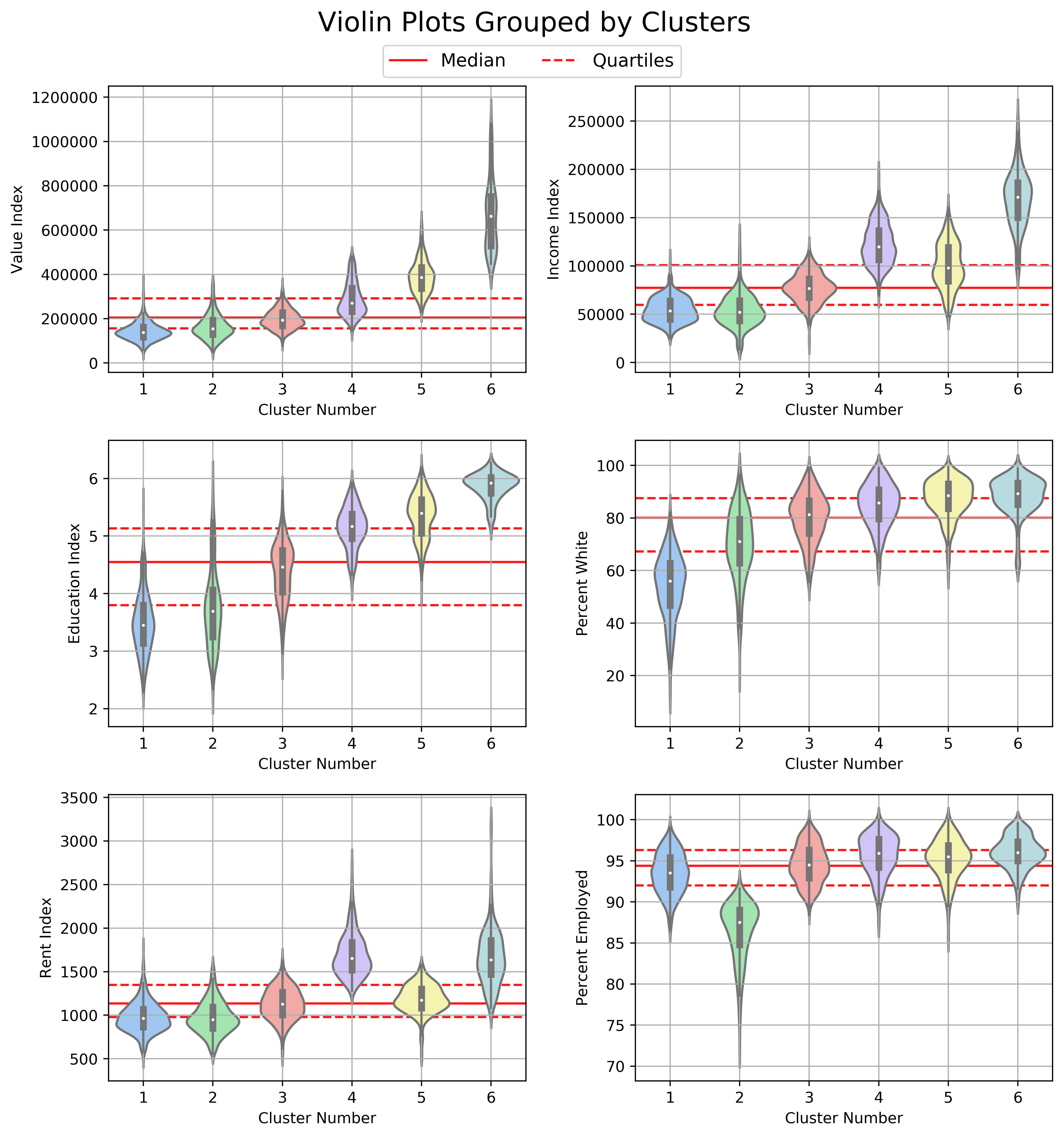
It’s clear that logically ordering the clusters by median home value index helps to get a better intuition of the neighborhood socioeconomic information contained in each cluster. Education index and percent white follow the same ordering pattern as value index and would have yielded the same results. Income index, rent index, and percent employed had similar orderings but diverged for a few of the clusters.
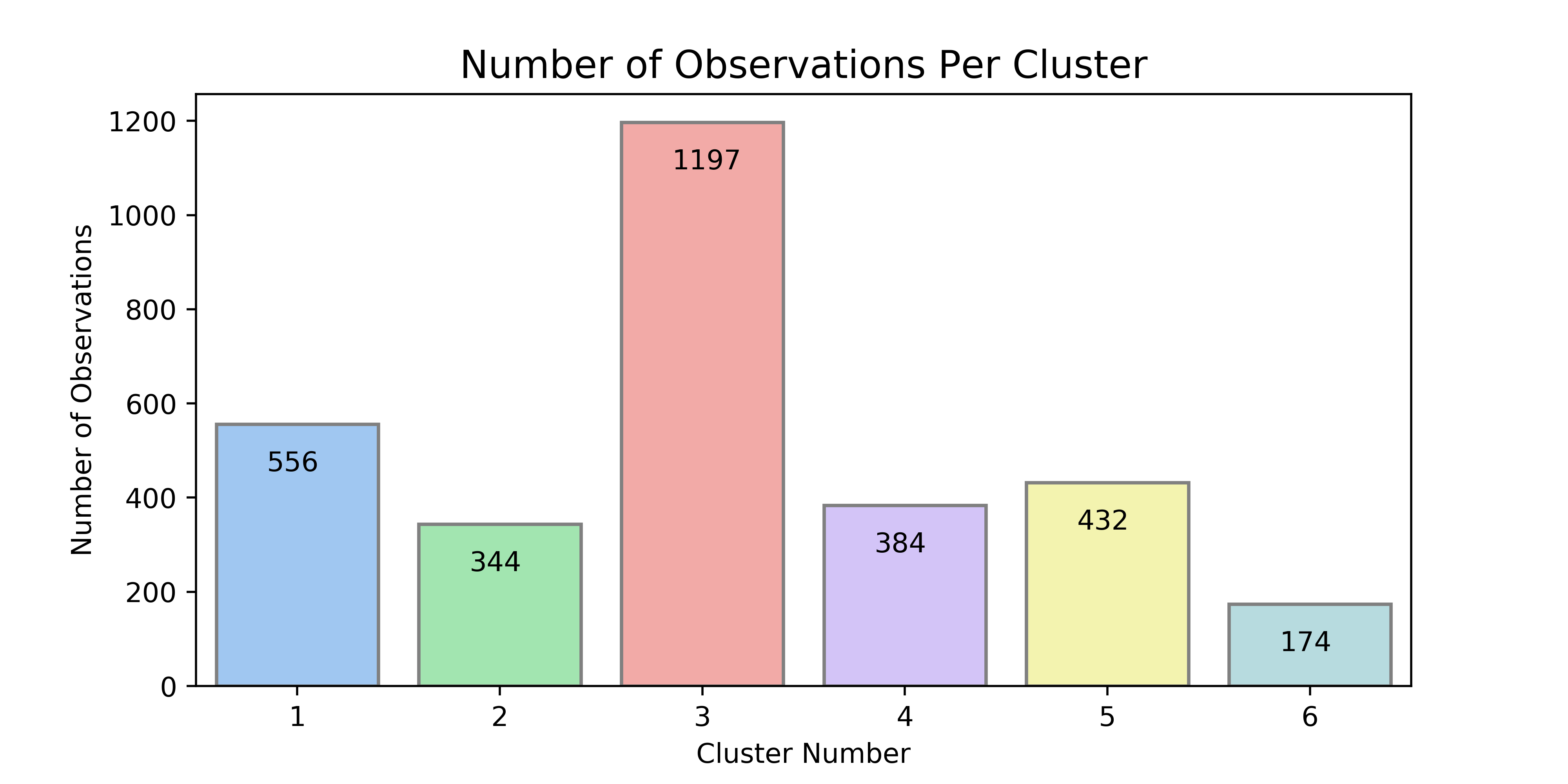
Cluster 1 is the second largest group and contains the poorest neighborhoods, with home values, income, and education well below the 25th percentile. Cluster 2 displays similar characteristics to Cluster 1 except with a higher percentage of white population and the lowest employment rate. Cluster 3 contains the majority of observations (~39%), which is not surprising since the distribution of each feature for this cluster is centered squarely along the median in the violin plots. Cluster 4 has the highest rent and the second highest income, although the home values are only slightly above the median. Cluster 5 has higher home values than cluster 4 but lower rent and income. Cluster 6 is the smallest group and contains the most affluent neighborhoods in the Austin MSA. The variability of home values in cluster 6 is extremely large, with values ranging from \$400,000 to \$1.2 million. The same is true to a slightly lesser extent of income in this cluster.
There are many interesting insights that can be gleaned from the violin plots. Looking at the education index, the variability decreases rapidly moving from cluster 1 to cluster 6. This is almost exactly opposite to the variability in home values and to a lesser extent income. My interpretation of this is that some people with a higher education don’t ever break through their income ceiling, but to reach the upper echelon of affluence, you almost certainly need to have some college education (which coincides with an education index of 5). The higher the education attained, the better.
The interactive map below shows the clustering for each neighborhood by year. Hover over each to see more information.
Cluster Movement Between Years
Thus far this analysis has focused on neighborhood groups without regard to the year of the observation, but now I am going to transition into talking about specific neighborhoods and how they change over time. Specifically, I’ll be investigating the neighborhoods that move rapidly between clusters from year to year. To facilitate this, I first need to aggregate the different years for each neighborhood (which, up until now, have been treated as distinct observations), and create a list of the cluster group that the neighborhood was in for each year. This is quite simple.
geoid_clusters = data.groupby('geoid')['clusters'].apply(list).to_frame()
Next, I need to find the maximum change in each of the newly created cluster lists. The function below is applied to the lists to extract this information.
def max_change(x):
change = np.max(x) - np.min(x)
if x.index(np.max(x)) < x.index(np.min(x)):
return change * -1
return change
The if statement above checks whether the largest cluster occurs before or after the smallest cluster. If the largest cluster occurs before the smallest cluster, then the neighborhood is deteriorating (meaning that home values and other features are getting worse), and the neighborhood is improving if the opposite is true. I use the terms deteriorating and improving loosely here, because everything comes at a cost to someone. The breakdown of the max change is displayed in the figure below.
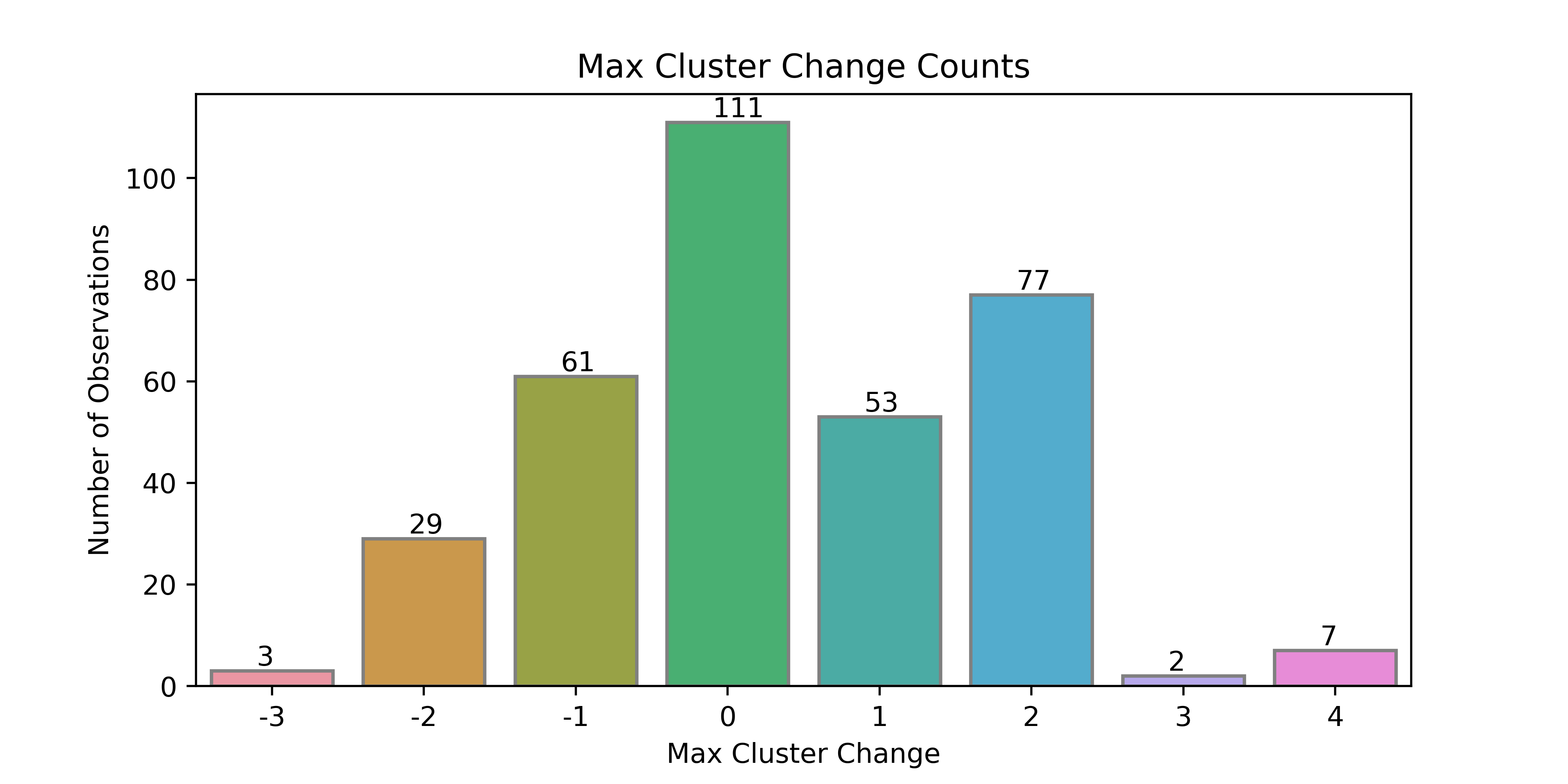
Most of the neighborhoods (~32%) did not change clusters at all, which is not surprising. About 97% of neighborhoods changed by 2 or fewer clusters, which is also expected given that the difference between adjacent clusters is relatively small. The most interesting neighborhoods are the edge cases where the neighborhood moved through at least 3 clusters, specifically the 7 that moved by +4 clusters. The maps showing the maximum cluster change are below.
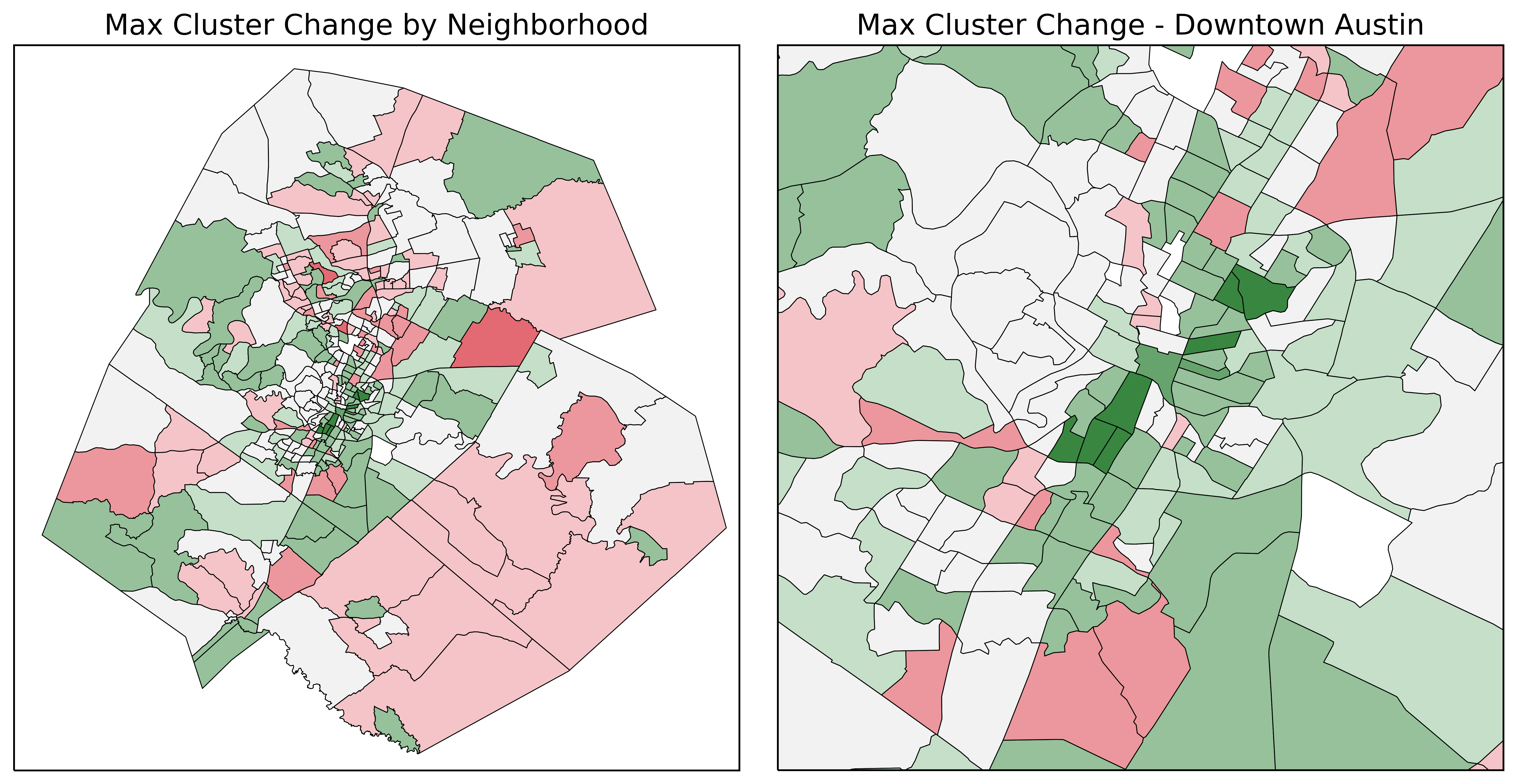
Neighborhoods filled red are areas that deteriorated during this projects time-frame, with color intensity indicating the degree of change. Neighborhoods filled green are areas that improved. Neighborhoods which did not change cluster are not filled (or filled with ‘none’ color).
The 7 neighborhoods which experienced a max change of +4 clusters are directly adjacent to the Downtown Austin area, with 3 of them occurring east of downtown and the remaining 4 residing south of downtown. Below is the average of each of these 7 neighborhoods over the time-frame of this project.
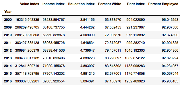
These neighborhoods saw on average a 242% change in home values (and in turn property taxes), a 140% change in income, and a 139% change in rent. The education level increased from less than a high school degree to at least some college while the percentage employed stayed relatively stable. However, the most disheartening change, and the final point of this project is the change in percent white within this grouping. These neighborhoods lost on average one third of their minority ethnicities.
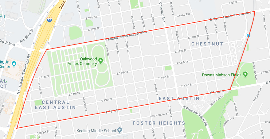
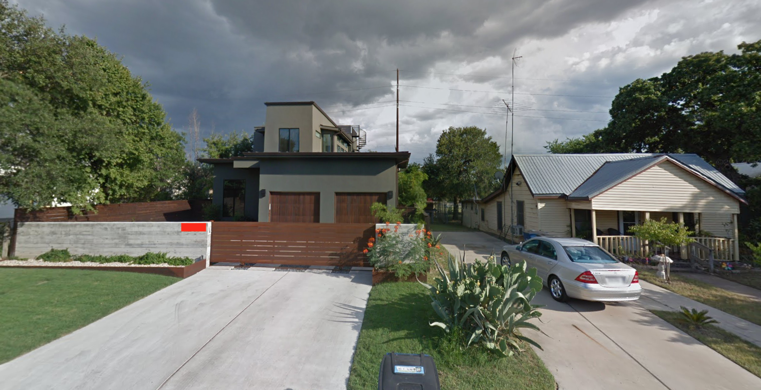
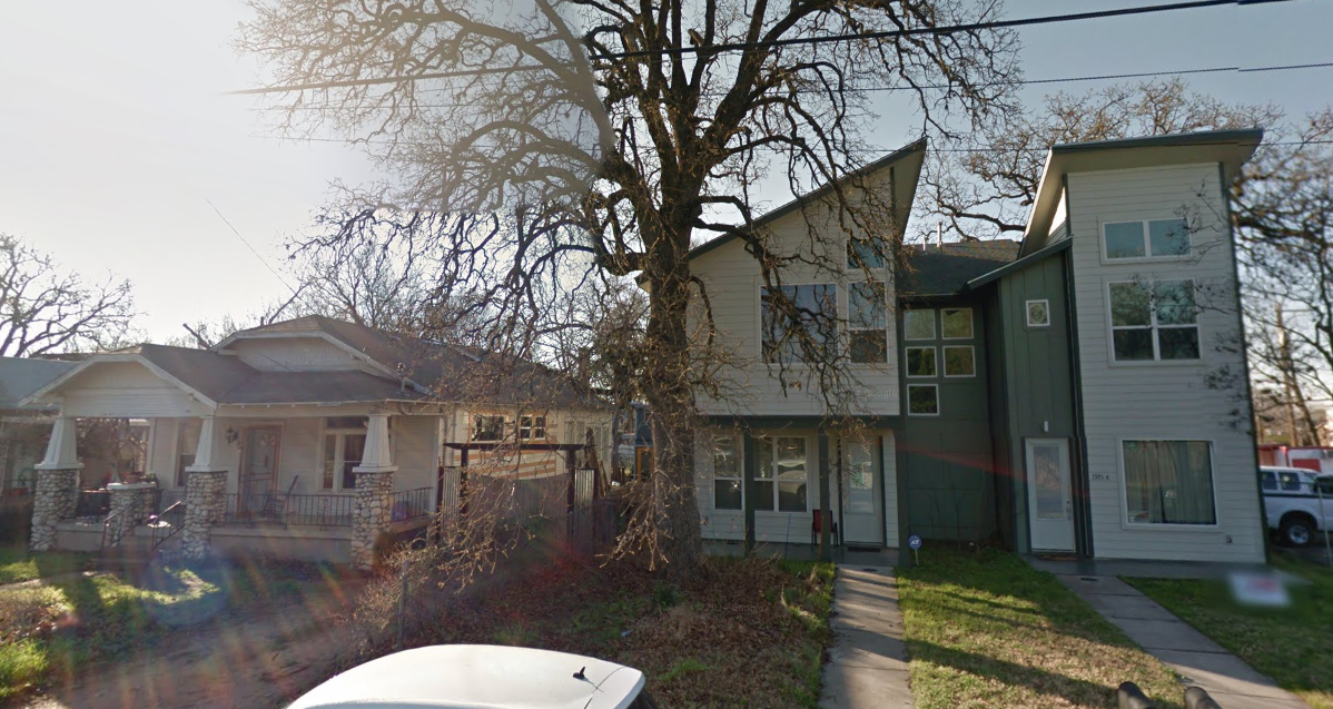
The most extreme loss of ethnic diversity occurred in census tract 8.03 (geoid 48453000803), which went from 22.25% white to 77.74% white in the span of 16 years. That’s a loss of 55.50% of the minority population! This neighborhood is bounded by Interstate 35 to the west, the metro rail to the east, Martin Luther King Jr. Blvd. to the north, and East 12th street to the west (see map below).
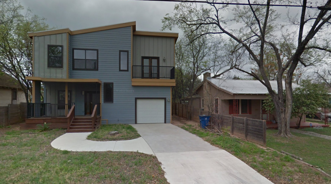
It’s extremely common now to drive through this neighborhood and see visual signs of “New Austin” vs “Old Austin”, as seen in the images below, which are all taken from census tract 8.03.
Part 6 - Closing Remarks
The point of this project was not to argue for or against gentrification or urban development in general; both sides of the debate offer valid arguments. My ultimate goal was to empower the City of Austin with ample information to make responsible developmental decisions, while keeping the minority voice in mind.
The diversity that Austin boasts about and strives for is present right now, but is dwindling and is in danger of permanent displacement. The ever-increasing price inequality in Austin (and the entire U.S. for that matter) disproportionately affects the minority population. Without proper care when planning urban development projects, these populations could be pushed to the outskirts, financially segregated and marginalized. This is not something that fits into Austin’s “Vision for the Future”.